The Cost of Sneaky Power BI Workarounds
Core Visual workarounds allow you to get some pretty cool looking visuals. But every one of these has a hidden cost. I look into a few of my own workarounds and the knock on effects of these hacks.
The last long piece I wrote on here was about storing colours as hex codes in measures, and halfway through it is a sentence I have been meaning to pick up ever since:
Conditional formatting is not offered on every property of every visual, and where it is not offered, a measure will not rescue you.
This is what happens next.
Because when the format pane will not colour the thing you want coloured, most of us do not give up. We build the colour out of something else: a second series that returns blank, one measure split into three, an error bar that exists purely to hold space, a transparent line used as a ruler. It works. I have shipped all of them.
None of those LinkedIn posts ever added up the bill. Four of them ended on a shrug, some version of and of course you will need a custom tooltip, and then I moved on to the next chart. Written out one after another, the pattern is hard to miss: every one of these tricks costs you measures that mean nothing to the business, and those measures are invisible to the reader and can still show up in the tooltip, the export and the screen reader.
So here they all are in one place, with the bill attached. And because I re-checked every one of them against the current build before writing this, there is a better ending than I expected: Microsoft has quietly paid off two of the biggest items.
First, the colour rules worth keeping
Before any of the tricks, the boring part, because a clever workaround applied to a bad colour decision just gets you an elaborately bad chart.
These are the five rules I wrote down years ago and have not needed to change:
That last one makes most of the tricks in this article easier. Here is a stacked chart where seven segments exist and three of them matter:

Nothing on that chart is hidden. The grey segments are all still there and still labelled. But because the accent budget went on three of them, the chart has an argument instead of just a legend.
Hold onto that idea, because almost everything below is a way of colouring one thing while leaving the rest alone.
Where the format pane stops
Conditional formatting is the main place the format pane accepts DAX. Click the fx button beside a property, set Format style to Field value, and point it at a measure that returns a hex code. That is the mechanism the whole previous article was about.

Where that button exists, life is easy. A clustered column chart colouring its columns by a sentiment measure takes about two minutes, and there is no trickery in it at all.
The trouble has always been the list of properties that offer it. For years, lines did not. Neither did the shaded area under a line. Neither did an individual series on a chart driven by a legend. And the moment a colour decision falls outside that list, you stop formatting the chart and start constructing it, which is where the rest of this article lives.
What changed in July 2026
This is the part I did not expect to be writing.
In June 2025 I posted a bump chart built from the native line chart and visual calculations, and partway through it I had a grumble:
The colouring of the various lines can be a bit tricky to make it look good. It would be great if there were conditional formatting for the lines (one of the many on the wish list).

Thirteen months later that wish was granted. The July 2026 release shipped conditional formatting for line charts and for visuals that carry a legend, generally available rather than preview. Microsoft Learn names bar, column, line, pie, donut and treemap charts among others, and Microsoft’s own deep dive adds area, stacked area, combo, ribbon and funnel.
It is genuinely good, and it works in two quite different ways depending on how many series your chart has. That distinction matters, so it is worth being precise about it.
One line: the colour changes along it
On a line chart with a single series and nothing in the Legend well, the fx button on Lines then Color gives you per data point colouring. A Segment type setting appears, defaulting to Center with a Gradient toggle on. Turn Gradient off, or pick Left or Right, for a hard change at each point.
Better still, Shade area picks up the same conditionally formatted colours, and markers get their own independent fx button. That is both halves of the complaint I made back in May 2025, closed.
More than one line: the colour changes per series
Put a field in the Legend well and you get the other behaviour: each series takes one colour, from a measure evaluated in that series’ own filter context.

Those two measures look nearly identical and they do not behave the same way at all. The first:
High Risk Spend Colour =
VAR __top = "#ffb703"
VAR __main = "#1E6FD9"
VAR __colour =
    IF ( [High Risk Spend %] > 0.10, __top, __main )
RETURN
    FORMAT ( __colour, "0" )
and the second:
High Risk Spend Max Colour =
VAR __top = "#ffb703"
VAR __main = "#1E6FD9"
VAR __tbl =
    CALCULATETABLE (
        ADDCOLUMNS (
            DISTINCT ( DimDate[Year] ),
            "@spend", [High Risk Spend %]
        ),
        ALL ( DimDate )
    )
VAR __maxx = MAXX ( __tbl, [@spend] )
VAR __colour =
    IF ( __maxx > 0.10, __top, __main )
RETURN
    FORMAT ( __colour, "0" )
The first one asks “is this category above ten per cent?” and gets answered once for the whole line, at the line’s own grain. A category that sat at four per cent for two years and spiked to sixteen in the middle averages out under the threshold, so it stays blue. It is invisible, and it is exactly the category you wanted flagged.
The second one builds a table of years, evaluates the measure against each one, and takes the maximum. Now “did this line ever cross ten per cent?” gets a proper answer, and the spiky line turns amber alongside Marketing.
Neither is right or wrong. But per series colouring evaluates your measure once per series, and if you write it as though it runs per point you will get a chart that is quietly, confidently incorrect. That is worth knowing before you trust one in front of an executive.
Build one: colour it the same as the background
Power BI data labels on a column chart are a running argument. The label wants to sit outside the column. If there is no room above the tallest column it goes inside instead, and when you are switching measures through a field parameter you get a chart where the labels look fine on one measure and awful on the next.
The obvious fix is to set the Y axis maximum from a measure, through the fx button beside Maximum under Y-axis, Range, so there is always headroom, and it does work:

Then somebody drills down, and the columns render as slivers at the bottom of a chart scaled for the level above.
The reason is worth understanding rather than just working around. An axis maximum is one number for the whole visual, so whatever measure you point at it gets evaluated once, in the visual’s own filter context. Write [Y Axis] * 1.2 and you get 1.2 times the total of everything on the chart, not the tallest column, so you need a MAXX over the axis column before anyone drills, and that MAXX only knows one level of the hierarchy. You can write your way out of it with an ISINSCOPE ladder, but now the chart’s appearance depends on a piece of DAX that has to know the hierarchy.
There is a route that needs no granularity logic at all, and it is the one I use.
The invisible error bar
An error bar is evaluated per column, at whatever grain the chart is currently showing. So instead of telling the axis how tall to be, give every column an invisible companion that is twenty per cent taller than it, and let the axis work it out for itself.
Error Bars = [Y Axis] * 1.2Then, in the Analytics pane:
- Add an Error bar, set Type to By field, and put the measure in Upper bound. Leave Lower bound empty.
- Set Relationship to measure to Absolute.
- Turn the Bar on, then set its colour to match the chart background.
- Turn Markers, Error labels and Tooltip off.

The error bar is now present, sized per column, and invisible. The axis maximum follows it, the labels always have room, and drilling from months to days just works. 1.2 is arbitrary, and I have used anything from 1.1 to 1.35 depending on how tall the labels are.
A note on scope, because I was sloppy about this on LinkedIn: error bars are offered on the clustered bar, clustered column, line, and line and clustered column charts, which is the full list in Microsoft’s Analytics pane documentation. Not on everything.
Error bars for column chart data labels.pbix github.com/InsightfulAnalytics/PBI-Files
What it costs. One measure that means nothing to anybody, sitting in a field well on the Analytics pane. It has no business definition, it will never be asked for by a user, and it is going to turn up later in this article for reasons you will not enjoy.
Build two: a transparent line as a ruler
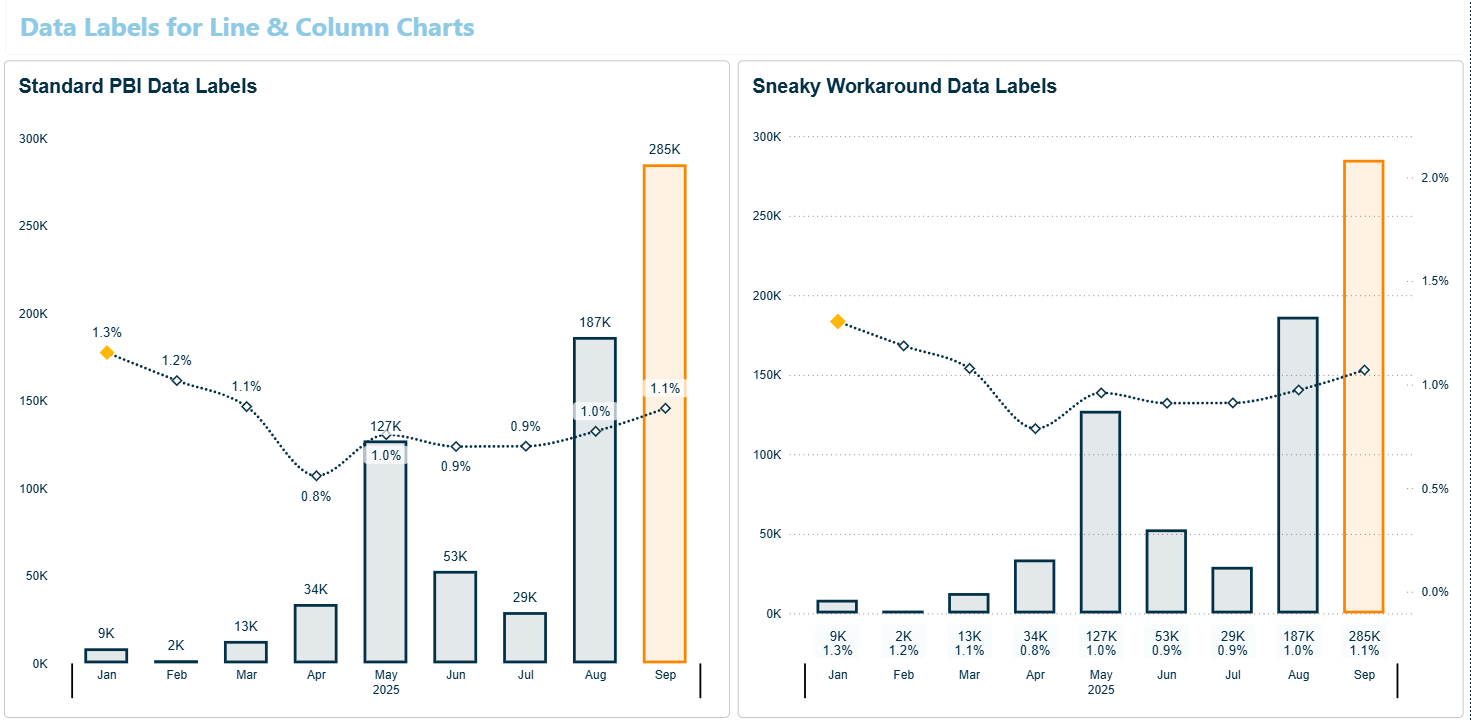
Same problem family, further along. Sometimes the labels should not be above the columns at all, they should be in a tidy row under the chart, the way a table would show them.
The usual advice is to put a table next to the chart. Anybody who has tried this knows why it does not work: getting a table’s columns to line up with a chart’s x axis positions is near impossible, and even an approximate match breaks the moment somebody filters to a different number of months.

The trick is to build a ruler out of a line nobody can see. Return the maximum of the Y axis, add a line series at a negative percentage of it, around minus fifteen per cent, make that line transparent, and attach custom data labels to it. Then set the Y axis minimum and maximum manually so the whole arrangement stays in frame, and turn Round range off so Power BI stops helpfully adjusting your numbers.
Visual calculations are the sane way to write the DAX for this, and they reached general availability in the May 2026 release, having been on by default since September 2024.
Data Labels Above X Axis.pbix github.com/InsightfulAnalytics/PBI-Files
What it costs. More than the other two builds:
- A rail calculation and a set of custom label calculations (visual calculations in my file), none of which mean anything.
- It is tuned to the height of the visual. Resize the chart vertically and the gap between the labels and the axis drifts, so you re-tune it.
- It breaks outright on data that crosses from positive to negative, because the labels collide with the plot area.
I would use this on a chart where the data is reliably positive and reliably within a predictable range. I would not put it in a report I was handing to somebody else to maintain, and I would think hard before using it anywhere the page layout is likely to change.
To be clear about why it still exists: there is still no native way to place data labels outside the plot area. I checked the current column chart, line chart and axis documentation rather than trusting the release notes, and none of the label positions, inside, outside or centred, puts a label below the plot area.
Build three: split one measure into three
The third shape is the one where the chart stops being a picture of your measure and becomes a picture of three measures pretending to be one.
The range bar
Power BI has no range bar, no floating bar and no dumbbell chart, and nothing shipped in the last year to change that. But a stacked bar will do it if you lie to it. Build a min, a max and a variance measure, stack the min and the variance, then make the min segment invisible so only the variance is drawn, floating in mid air.

One correction to my original post while I am here. I described step three as making the min bar “100% transparent”, which made a few people go looking for the eight digit transparent hex code from the previous article. That is not what this uses. It is the visual’s own per series transparency slider: Format visual, Visual, Bars, Colors, pick the individual series under Apply settings to, then Transparency. It has been there since the December 2023 update and it is a normal supported setting, not a trick.
The variance highlight
Same idea, put to better use. To show variance against budget inside a bar rather than beside it, take the minimum of sales and budget as the base, then create two more measures for positive variance only and negative variance only. Stack all three, colour the variance segment from a sentiment measure, add custom data labels, and turn on series explosion so the segments separate.
What you end up with is a bar that reads as a single quantity with the beat or miss called out in colour at the end of it, which is a genuinely nice way to show budget performance.
Variance Highlights Stacked Bar Chart.pbix github.com/InsightfulAnalytics/PBI-Files
What it costs. Two extra measures that exist only so the stack adds up, custom data labels because the native ones now describe segments rather than values, and a native tooltip that is going to describe the construction rather than the number.
That last one used to be the killer, and it is the next section.
The tooltip used to tell on you
Here is the thread running through four of the posts I wrote about builds like these. The 2025-01-27 range bar: the only downside for the visual is that native tooltips are turned off. The 2025-03-30 line highlight: the measure will be duplicated if using the standard tooltip, hence the use of a custom tooltip. The 2025-05-08 variance bar: this method also makes it necessary [to] create a custom tooltip. The 2025-05-21 line workaround: a custom tooltip is necessary.
Four posts in under four months, all ending in the same place. The chart looks right and the hover gives the game away, because the helper measures are real fields in real field wells and the default tooltip reports what it finds.
The answer for years was to build a report page tooltip, and the recipe is short enough to give once:
- Start a new page and hide it.
- Build the visual you want in the hover. A table or the card visual usually, though there is nothing stopping you putting a chart in there.
- In Canvas settings, set Type to Tooltip (320 x 240), or to Custom and size it to the visual so there is no dead whitespace. Set Page View to Actual Size while you are designing it.
- Turn on Allow use as tooltip for that page.
- On the source visual, under General then Tooltips, set Type to Report page and pick the page.

What changed, and it is quite a lot
Two things happened in 2026 that between them remove most of the reason that recipe was compulsory.
First, the July 2026 conditional formatting above. Colouring a single line by value used to mean layering a second copy of it, and that copy duplicated the value in the tooltip. Now it is one line, so there is nothing to hide.
Second, and this one is useful regardless of colour, the June 2026 release added Tooltip fields only under Format visual, General, Tooltips, Options. Turn it on and the tooltip shows only what you have explicitly put in the Tooltip field well, and suppresses the visual’s own fields. Microsoft describes the June tooltip options as “a step between the default tooltips shown and crafting a fully customized page for the tooltips”, which is a fairly direct description of the problem four of my posts were complaining about.
There is a third, smaller change in the same direction: modern visual tooltips, the default for new reports since May 2024, went generally available in January 2026, so the default hover picks up your theme’s colours rather than looking like a Windows 95 dialog. Older reports keep the old style until you select Reset to default.
What still forces a tooltip page
Rich content, and only rich content. Nothing native will put a chart, an image or a swatch legend inside a tooltip, so if the answer to “why is this bar this colour” needs a picture, you are still building a page.
And if you do build one, two documented limitations are worth knowing before you commit, because both of them apply to the multi line charts these colour tricks tend to target:
- On a line chart, a report page tooltip shows one tooltip for all the lines, and the legend field does not filter it. So the hover cannot tell you which line you are pointing at.
- Tooltip pages are not interactive, and screen readers can’t read them when they appear over a data point, so if the tooltip is where the real information lives, it is invisible to anybody using one.
I have seen no first party number for what a tooltip page costs at runtime, so I am not going to invent one. It is another page of visuals that has to be queried, which is not free, but the honest answer is that I do not have a figure and neither does anyone else I can find.
Report page tooltips, in the Power BI docs learn.microsoft.com
What the scaffolding still costs
So the tooltip bill is mostly settled. The measures themselves are a different matter, and this is the part none of the original posts mentioned because I had not thought about it properly.
Every build above leaves measures in field wells that have no business meaning: an error bar whose only job is to hold space, a rail measure used as a ruler, a minimum that exists so a stack adds up, a variance split in two so it can be coloured. They are invisible on the page. They are not invisible everywhere.
They turn up in the export
This one catches people. A report user right clicks your beautifully clean chart, exports the data, and gets a column called Error Bars sitting next to the number they actually wanted.
Worth being precise here, because Show as a table and the three export options do different things:
| What the user picks | Do your scaffolding measures show up? |
|---|---|
| Show as a table | Only helpers in the field wells. In my test the transparent rail showed up and the error bar bound did not. |
| Summarized data | Yes. |
| Data with current layout | Not offered on these charts. It is a table and matrix option. |
| Underlying data | Yes, and wider: every measure homed in a table that supplies a measure to the visual, plus nonhidden columns from those tables and the tables they relate to. The user needs build permission to run it. |
Two things that sound like escape routes and are not.
Formatting a measure invisible does not remove it. Setting an error bar to the background colour is a formatting choice. The measure is still in the error bar’s settings, and it still goes out in the export.
Visual calculations do not get you out of it either. They are excluded from the underlying data export, which is the sentence people remember, but their results do land in the summarised and current layout exports, and they do appear in the field list on the visual. They do keep the calculation off the semantic model and out of every other report, which is worth having. It is just not a way to hide anything from a user.
The one mechanism that keeps a helper out of Show as a table and the summarised export is hide fields on the visual. Underlying data exports still include it, Microsoft is explicit that hiding a field does not remove it from the visual or the visual matrix, and it does not reach Analytics pane fields such as error bar bounds at all. The compute happens either way.
One more, for anybody building financial matrices: extra measures push you towards the 150,000 data intersection ceiling on a matrix export. Microsoft’s own advice when you hit it includes limiting the number of measures, which is a sentence worth remembering when your chart is carrying four that draw nothing.
What they cost in query time, honestly
Less than the folklore says, and it is worth correcting because I have repeated the folklore myself.
A visual normally sends one DAX request carrying all its measures, not one query per measure. Vertical fusion can then fold measures evaluated in the same filter context into a single storage engine query. So an error bar measure that is just [Y Axis] * 1.2, sitting in the same filter context as the measure it multiplies, is close to free at the storage engine. A helper that removes a date filter fuses only if the storage engine can resolve that filter on its own, and a time intelligence helper will not.
There is a real, measured number, but for a different problem: report level measures in a thin report over a live connection, where dependency analysis at query time has been shown to turn a 16 millisecond query into about a second and a half once 3,000 unused query scoped measure definitions were added to it, in a 2021 test by Chris Webb. Model measures do not pay that penalty. If your scaffolding lives in report measures on a live connected report, it is worth cleaning up the ones you abandoned.
What they cost the reader who cannot see the chart
I want to be careful here, because I am describing an expectation rather than a documented behaviour.
Power BI’s accessible data table, which a user opens with Alt + Shift + F11, is built from the visual’s fields, and tooltip fields appear in it. Microsoft documents nothing at all about how a transparent series or an error bar bound field is announced, and there is no equivalent of an aria-hidden for a field well.
So the reasonable assumption is that a chart carrying a transparent ruler, an invisible spacer and a min segment that means nothing presents all of that to a screen reader user as though it were data. If you build a report for an audience where that matters, this is worth half an hour of your own testing rather than my guess.
Is the colour worth it
Sometimes, and less often than I used to think.
Writing these ten posts out one after another, what struck me is how consistently the cost is invisible at build time and visible later. Nobody notices the extra measure on the day they add it. They notice it when a user exports to Excel and asks what Error Bars means, or when somebody inherits the report and cannot work out why the stacked bar has a segment that is not in the data dictionary.
So the question I now ask before building any of these is not “can I do it” but “will this still be explainable in six months”. Which gives me a rough order:
- Use the native feature. Since July 2026 that covers considerably more than it used to, and the first move on any line chart should now be to check whether the fx button on Lines does what you need.
- Use the error bar trick freely. It is one measure, it does not lie about the data, and it survives drill down.
- Use the split measure builds deliberately. A variance highlight bar is worth its measures. A range bar is worth its measures. Just write down what they are for, because the next person will not guess.
- Think twice about the label rail. It is fragile and it is tied to the size of the visual. Beautiful in a demo, awkward in production.
Colour is supposed to carry meaning, not decorate. If the chart needs four scaffolding measures to make one number a different colour, it is fair to ask whether that number needed to be a different colour in the first place. Quite often the answer is that the page has spent its accent budget somewhere else, and the honest fix is to take colour off three other visuals rather than construct more of it here.
Which is more or less where the previous article ended too, so the two halves agree with each other. If you want the mechanism rather than the workarounds, that one is here: Power BI hex codes in measures, covering colour measures, theme colour names, the transparent hex code and how to find a palette worth standardising in the first place.
A note on dates
Everything above was re-checked against the Power BI documentation and against every monthly release up to the August 2026 update before publishing. Two things are worth knowing if you are chasing the same details: there was no December 2025 feature release, the archive runs November 2025 straight to January 2026, and the September 2026 summary is not out yet at the time of writing.
If a feature in here has moved since, it will have moved in the direction of needing less of a workaround, not more. That is how the last year has gone.
The original posts
If you want the short versions, or the comment threads underneath them, they are here:
- Error bars to make column chart data labels behave
- Showing data labels above the x axis
- A stacked bar chart for variance highlighting
- A range bar chart from the native stacked bar
- Faking conditional formatting on a line, back when you had to
- Highlighting a selection in a crowded line chart
- The custom tooltip recipe
- Sentiment colouring on a line and clustered column chart
- Heatmaps, and the five colour principles
- A bump chart from the native line chart and visual calculations
Most of the PBIX files are on the free stuff page if you would rather pull one apart than read about it.
Built a report that nobody can maintain?
Workarounds are fine until they are load bearing. If the report underneath yours needs untangling, that is what I do for a living.