Notes from a Power BI developer
Deep dives, measured results and hard-won lessons on Power BI, DAX and performance. Written for people who have to make the report actually work.
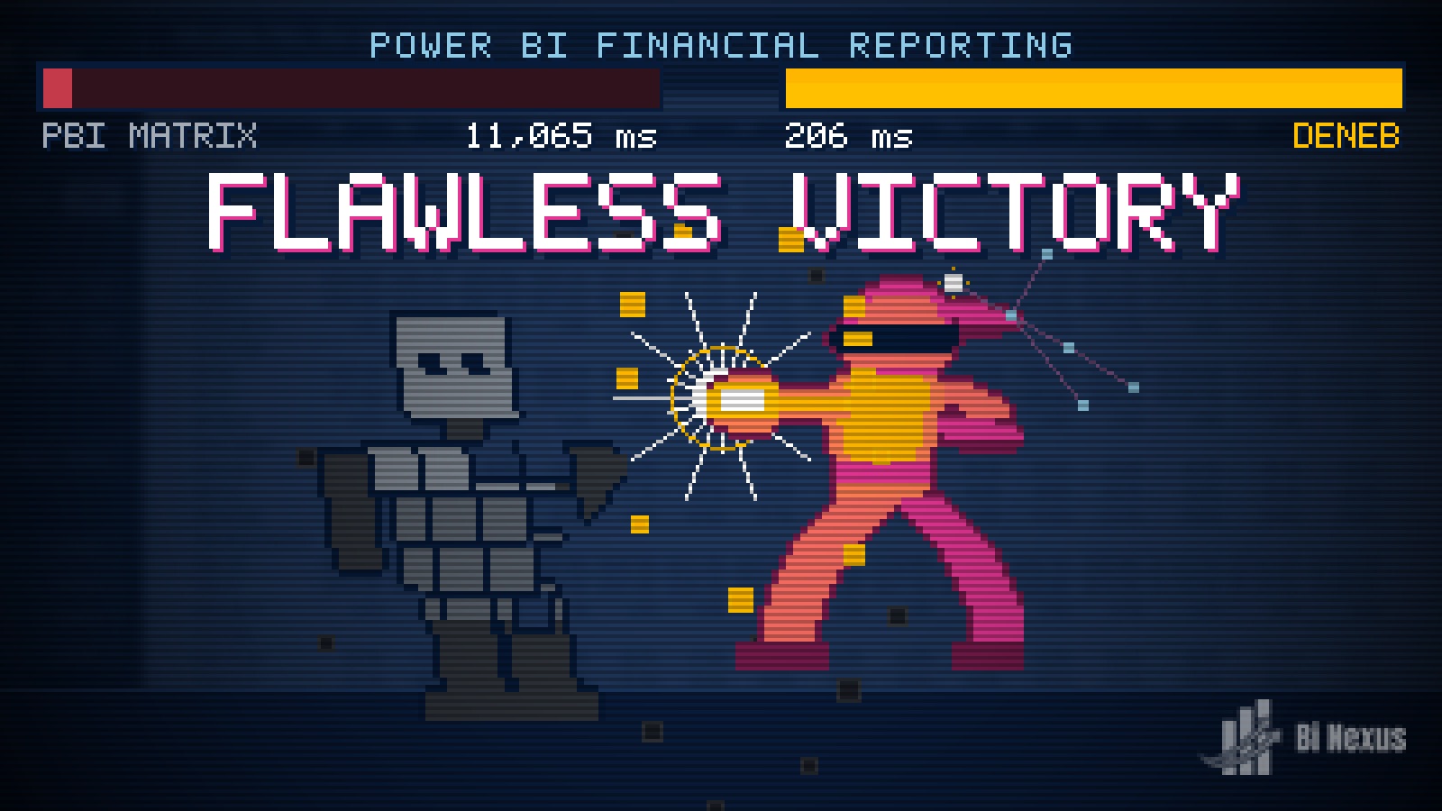
The Ultimate Guide to the Power BI P&L Style Matrix
Financial statements break Power BI capacities at month end, and the usual fixes aim at the wrong thing. Nine builds of the same statement take an eleven second matrix down to 206 milliseconds.
Read the articleMore posts
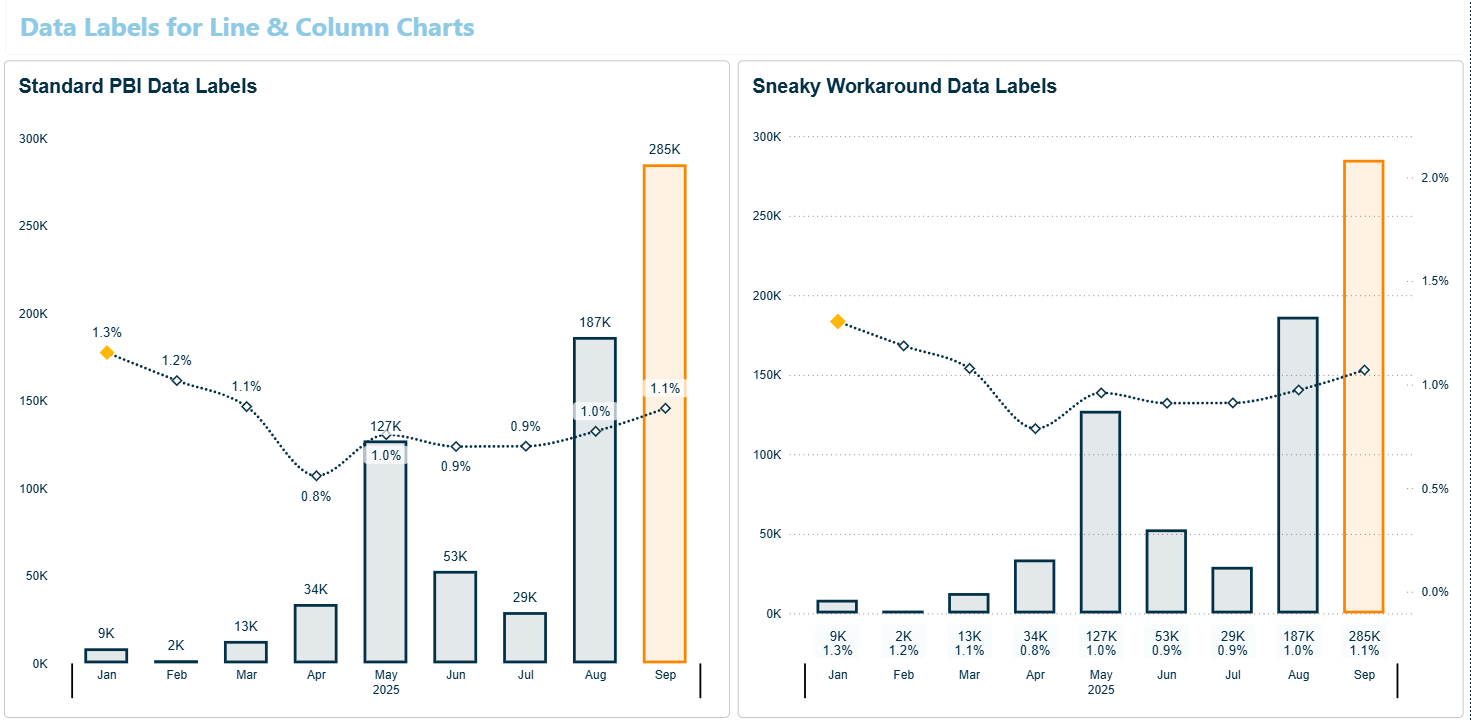
The Cost of Sneaky Power BI Workarounds
Core Visual workarounds allow you to get some pretty cool looking visuals. But every one of these has a hidden cost. I look into a few of my own workarounds and the knock on effects of these hacks.
Read the article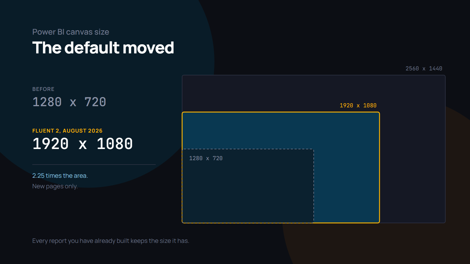
The Ultimate Guide to Power BI Canvas Size
New pages now start at 1920×1080. What actually changed across the 2026 releases, what a bigger canvas costs you in exports, mobile and embeds, and measured numbers for what it costs at render time.
Read the article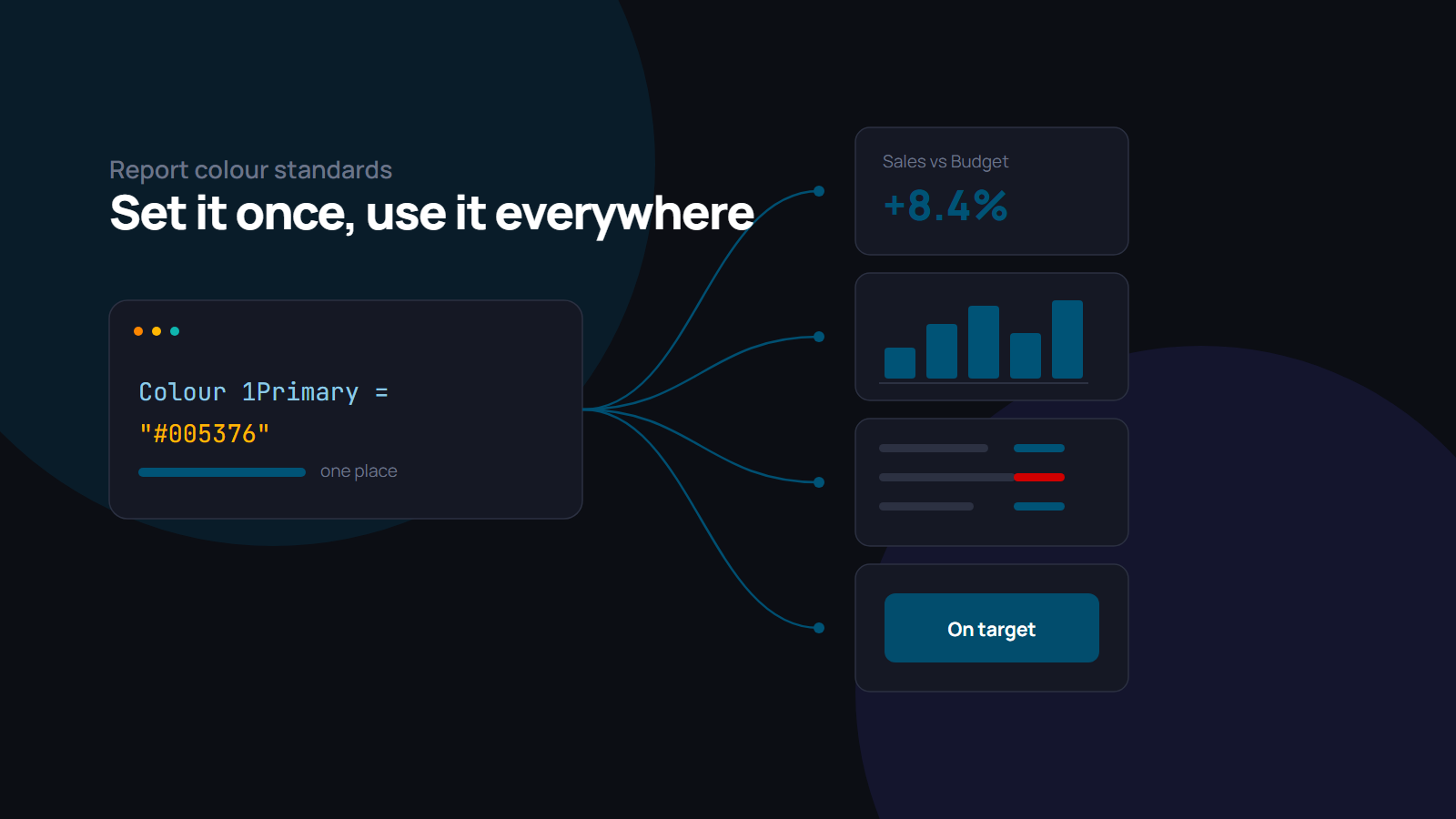
Power BI Hex Codes in Measures for Colour Consistency
Store hex codes in DAX measures and every visual reads the same colour standard. Colours in hex codes, theme colour names, the secret transparent hex code, and how to find colours that go together.
Read the article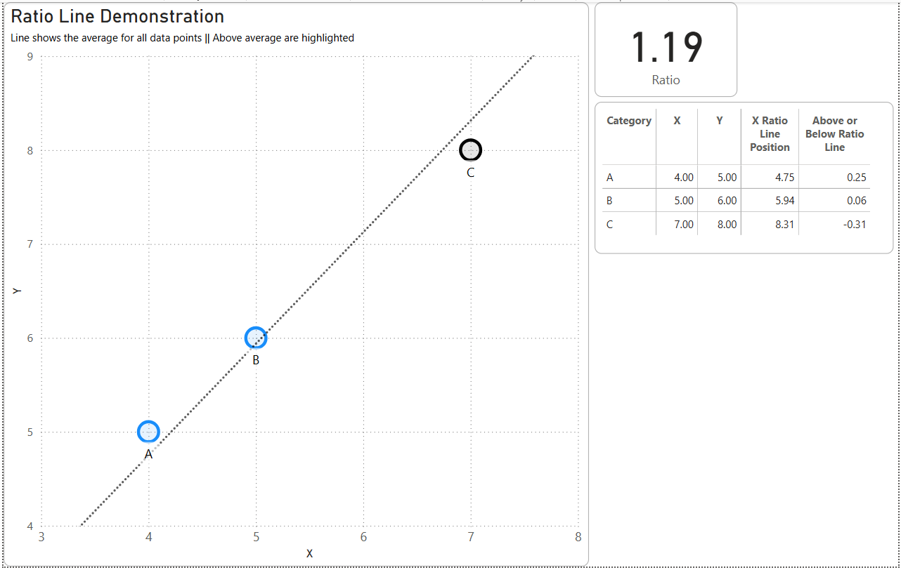
Power BI Scatter Chart Ratio Line
The scatter chart draws a ratio line and shows you no numbers at all. Here is what it actually calculates, and the DAX that puts the value and the variance back on the page.
Read the articleMore posts on the way
An ongoing series on Power BI performance, modelling and report design. New pieces land here as they are written.
Follow along on LinkedIn